
Create a seamless and engaging common wallet experience Contact me
Analytics Dashboard
Project Overview
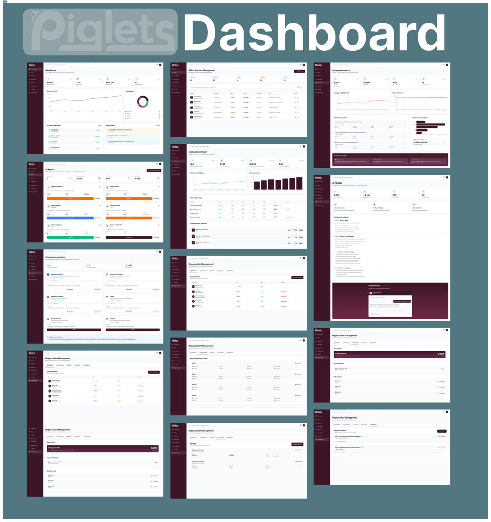
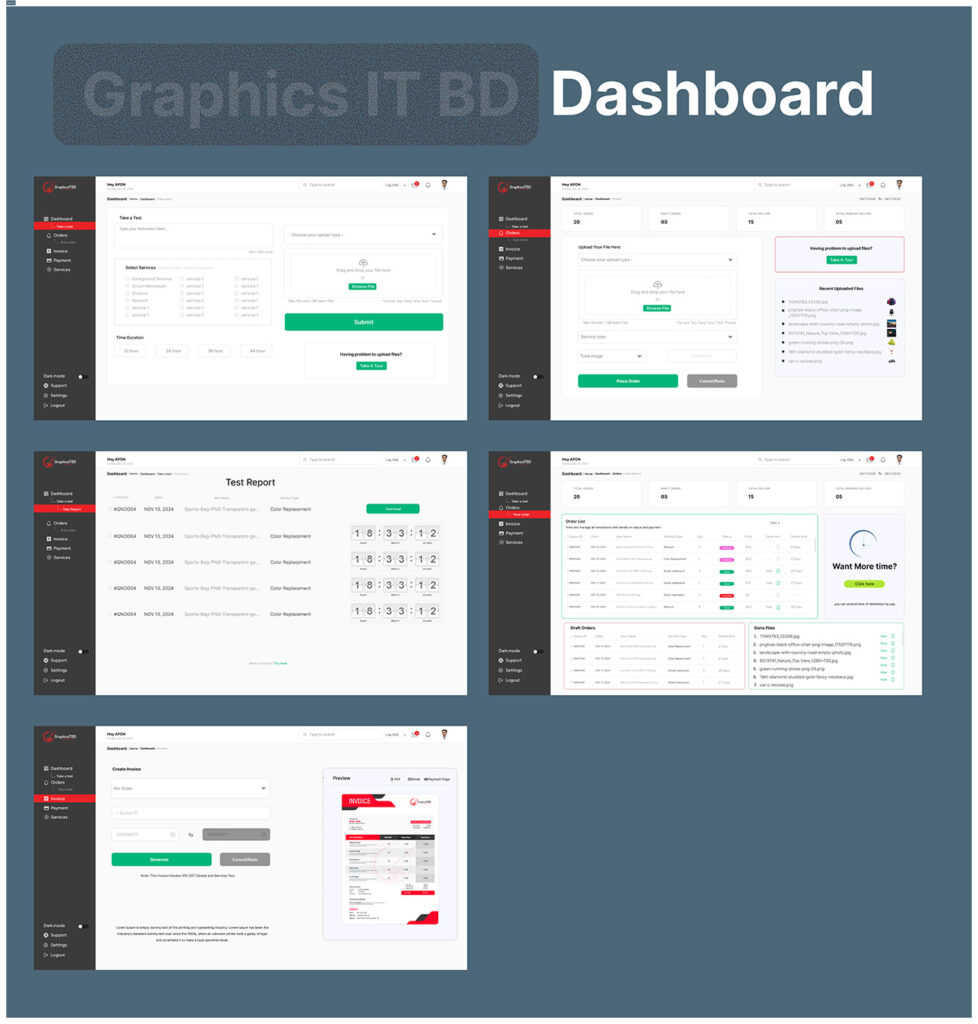
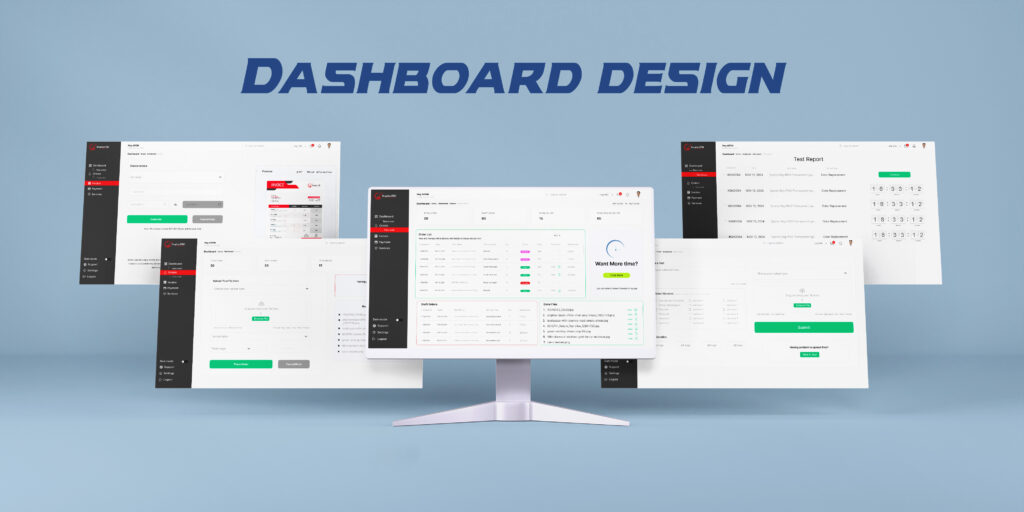
A modern, intuitive analytics dashboard designed to transform complex business data into clear, actionable insights. The interface focuses on information hierarchy, usability, and visual clarity—helping users monitor key metrics, identify trends, and make faster, data-driven decisions.
The Challenge
Business dashboards often contain large amounts of information, making it difficult for users to quickly understand what matters most. The goal was to create a clean dashboard experience where users could access critical information at a glance without feeling overwhelmed by data.
The Solution
I designed a structured dashboard with a clear visual hierarchy, intuitive navigation, interactive data visualization, and well-organized information modules. Key metrics are prioritized while charts, tables, filters, and activity insights are presented in a way that supports quick decision-making.
Key Features
- Overview of important business KPIs
- Interactive charts and data visualization
- Revenue, sales & performance tracking
- Advanced filtering and date-range controls
- Recent activity & transaction monitoring
- User / customer insights
- Performance comparison & trend analysis
- Clean navigation and scalable dashboard structure
- Responsive and user-friendly interface
UX Approach
The UX process focused on reducing cognitive load and improving information discoverability. I organized content based on user priorities, established a consistent visual hierarchy, and used familiar interaction patterns to make the dashboard easy to understand—even when displaying large datasets.
Design Direction
The visual design combines a clean, modern interface with purposeful data visualization. Consistent spacing, typography, cards, icons, and component patterns create a cohesive experience while allowing important metrics and insights to stand out.
My Role
UI/UX Designer
I was responsible for the overall UX structure, information architecture, wireframing, UI design, data visualization, component design, and interactive prototyping.
Tools
Figma · FigJam · Prototyping
Outcome
The final dashboard provides a focused and scalable environment for monitoring business performance. By simplifying complex information and emphasizing actionable insights, the design creates a more efficient experience for users who need to make decisions quickly.
Project Highlights
Data Visualization · Dashboard UX · Information Architecture · UI Design · Design System · Prototyping · Responsive Design